Custombox is a modern dialog library which is highly configurable and easily styleable.
Has a clear and simple API, works on mobile devices, and can be customized to match your style.
Overview
Check out the some following examples:
Features
Custombox has many characteristics, take a look.
- Open multiple dialogs at once and close them individually or all at once.
- Flexible close options and methods.
- Full-screen/viewport mode.
- Callback events for before and after open, complete and close.
Getting started
-
Usage
Provider Procedure NPM npm install custombox --saveBower bower install custombox --saveBasic download download.zip -
Include the files:
<link href="custombox.min.css" rel="stylesheet"><script src="custombox.min.js"></script> -
Include the optional legacy file:
The legacy file include all of polyfills necessary for the legacy browsers.
<script src="custombox.legacy.min.js"></script> -
Call the plugin when the body is load:
// Instantiate new modal
var modal = new Custombox.modal({
  content: {
    effect: 'fadein',
    target: '#modal'
  }
});

// Open
modal.open();
Effects
Custombox has multiple transitions that can be applied to your modals to add smooth animations to your page.
| Fadein | |
| Slide | |
| Newspaper | |
| Fall | |
| Sidefall | |
| Blur | |
| Flip | |
| Sign | |
| Superscaled | |
| Slit | |
| Rotate | |
| Letmein | |
| Makeway | |
| Slip | |
| Corner | |
| Slidetogether | |
| Scale | |
| Door | |
| Push | |
| Contentscale | |
| Swell | |
| Rotatedown | |
| Flash |
Options
This widget is separated into three parts: content, overlay, loader.
| Name | type | default | description |
|---|---|---|---|
| target | string | null | Set the URL, ID or Class. |
| effect | string | fadein | Set the effect name. |
| id | string | null | Set a custom ID. |
| container | string | null | Set the element (ID or Class) of the element container of the page, if it does not exist, will be one created automatically depending on the effect. |
| close | boolean | true | Allows the user to close the modal when press esc. |
| clone | boolean | false | Clone the element of the DOM. |
| animateFrom | string | top | Set an animation from the start (left, center or right). |
| animateTo | string | top | Set an animation from the end (left, center or right). |
| positionX | string | center | Set horizontal position of modal (left, center or right). |
| positionY | string | center | Set vertical position of modal (top, center or bottom). |
| width | string | null | Set a fixed total width (px, em or %). |
| speedIn | number | 300 | Set the speed start of the animation in milliseconds. |
| speedOut | number | 300 | Set the speed end of the animation in milliseconds. |
| delay | number | 150 | Set the wait before the transition effect start. |
| fullscreen | boolean | false | Set fullscreen mode. |
| onOpen | function | null | Callback that fires right before begins to open. |
| onComplete | function | null | Callback that fires right after loaded content is displayed. |
| onClose | function | null | Callback that fires once is closed. |
// Instantiate new modal
new Custombox.modal({
  // Options
  content = {
    target: null,
    effect: 'fadein',
    id: null,
    container: null,
    close: true,
    clone: false,
    animateFrom: 'top',
    animateTo: 'top',
    positionX: 'center',
    positionY: 'center',
    width: null,
    speedIn: 300,
    speedOut: 300,
    delay: 150,
    fullscreen: false,
    onOpen: null,
    onComplete: null,
    onClose: null,
  }
});
| Name | type | default | description |
|---|---|---|---|
| active | boolean | true | Display the overlay. |
| color | string | #000 | Set the overlay color. |
| opacity | number | 0.48 | Set the overlay opacity level. Range: 0 to 1. |
| close | boolean | true | Allows the user to close the modal by clicking the overlay. |
| speedIn | number | 300 | Set the speed start of the animation in milliseconds. |
| speedOut | number | 300 | Set the speed end of the animation in milliseconds. |
| onOpen | function | null | Callback that fires right before begins to open. |
| onComplete | function | null | Callback that fires right after loaded content is displayed. |
| onClose | function | null | Callback that fires once is closed. |
// Instantiate new modal
new Custombox.modal({
  // Options
  overlay = {
    active: true,
    color: '#000',
    opacity: .48,
    close: true,
    speedIn: 300,
    speedOut: 300,
    onOpen: null,
    onComplete: null,
    onClose: null,
  }
});
| Name | type | default | description |
|---|---|---|---|
| active | boolean | true | Display the loader. |
| color | string | #FFF | Set the color of the loader. |
| speed | number | 1000 | Set the speed in milliseconds of the loader. |
// Instantiate new modal
new Custombox.modal({
  // Options
  loader = {
    active: true,
    color: '#000',
    speed: 1500,
  }
});
Events
Events are sent to notify code of interesting things that have taken place. Events can represent everything from basic user interactions to automated notifications of things happening in the rendering model.
| Event type | Description |
|---|---|
custombox:overlay:open |
Callback that fires right before begins to open. |
custombox:overlay:complete |
Callback that fires right after loaded content is displayed. |
custombox:overlay:close |
Callback that fires once is closed. |
custombox:content:open |
Callback that fires right before begins to open. |
custombox:content:complete |
Callback that fires right after loaded content is displayed. |
custombox:content:close |
Callback that fires once is closed. |
document.addEventListener('custombox:overlay:open', function() {
  // Overlay opened
});

document.addEventListener('custombox:overlay:complete', function() {
  // Overlay completed
});

document.addEventListener('custombox:overlay:close', function() {
  // Overlay closed
});

document.addEventListener('custombox:content:open', function() {
  // Content opened
});

document.addEventListener('custombox:content:complete', function() {
  // Content completed
});

document.addEventListener('custombox:content:close', function() {
  // Content closed
});
Methods
| Name | Parameter | Description | Example |
|---|---|---|---|
| open | - | Open a modal dialog. | new Custombox.modal({}).open() |
| close | id (optional) | Close a modal dialog. | Custombox.modal.close() |
| closeAll | id (optional) | Close all modal dialogs. | Custombox.modal.closeAll() |
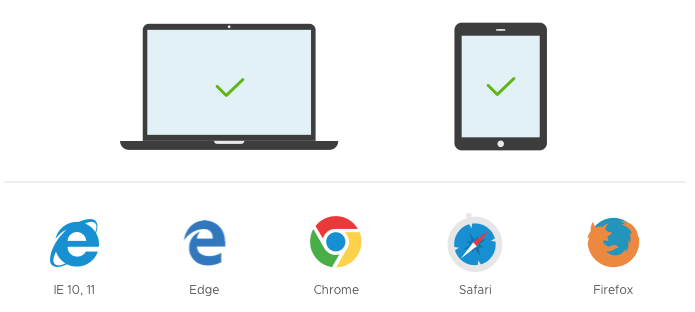
Browser support